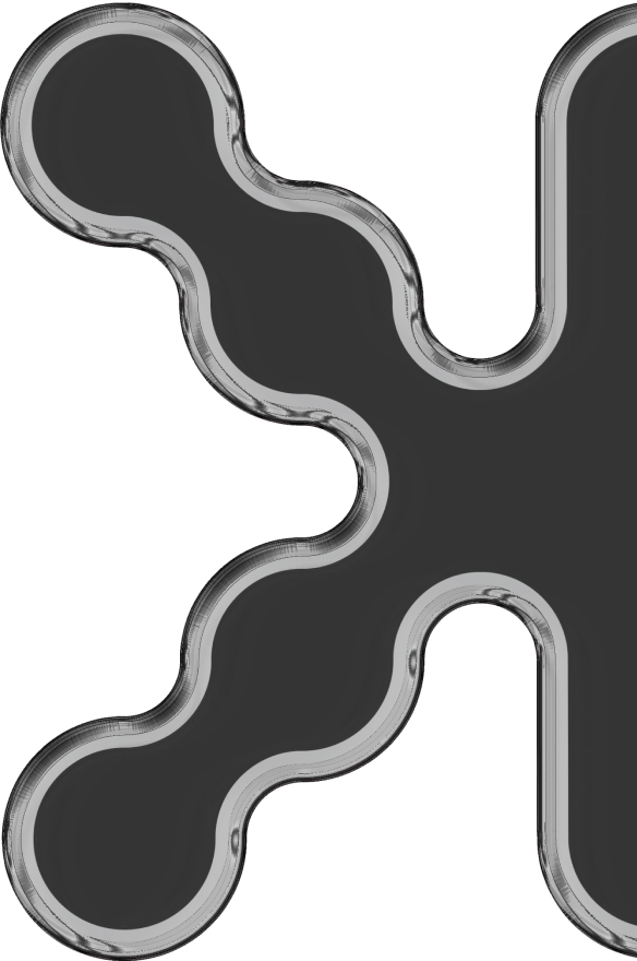

In the fast-paced world of digital innovation, a personal brand is never truly finished; it is a living organism that must adapt, breathe, and evolve. As a multidisciplinary designer, I have always believed that our visual identity should reflect not just where we are, but where we are headed. Today, I am proud to unveil the 2026 evolution of the BK (Burak Kazan) identity—a project that honors sixteen years of heritage while embracing the cutting-edge standards of tomorrow.
From 2010 to 2026: Maintaining the Core DNA
The journey began in 2010 with a signature-style monogram that represented the raw energy of a designer just entering the field. Over the years, that form has undergone several iterations, but the core silhouette—the skeletal structure of the “B” and “K”—has remained the primary anchor. In the latest 2026 update, the challenge was to maintain this brand continuity while applying modern minimalist design principles.
Design is an industry that updates its trends almost daily. As a professional, staying relevant means knowing when to strip away the noise. The new BK logo focuses on geometric precision, using a refined grid system to ensure every curve and terminal is optimized for high-resolution retina displays and digital environments. By preserving the organic flow of the 2010 original but executing it with 2026 technical rigor, the new identity achieves a perfect balance between human-centric design and tech-driven aesthetics.
A New Digital Showroom: The 2026 Website Launch
A brand update is incomplete without a space to showcase it. Along with the new identity, I have fully re-engineered my portfolio website to serve as a high-performance digital showroom. In the modern UI/UX design landscape, speed and accessibility are no longer optional—they are the foundation of trust.
The new platform is built with a mobile-first philosophy, ensuring that my 10+ years of work across fintech, iGaming, and luxury branding are accessible with zero latency. I have implemented a sophisticated dark-mode interface that utilizes ample whitespace and high-contrast typography to let the projects speak for themselves. This isn’t just a gallery; it’s an immersive user experience that reflects my dual capability as both a creative director and a technical developer.
Why Brand Evolution Matters
For any creative professional, updating your identity is a strategic move. It signals to clients and the industry that you are not stagnant. It shows that you understand the latest design trends and possess the technical skills to implement them. My 2026 branding is a testament to this mindset: a symbol of a decade-long journey refined into a sharp, authoritative, and visionary mark.
As we move deeper into the era of AI and hyper-digitalization, the value of a strong, recognizable, and authentic brand becomes immeasurable. The BK logo is now ready for the next chapter, standing as a bridge between a rich professional history and an unlimited creative future.
✦ BK

